Appearance
Frontend (Mini) Tutorial
The pages for the mobile application reside in the src/app folder. The main page that you first see once you start the application is based on the _layout.tsx file found in the (home) folder with routing handled using Stacks as described in routing.
If you inspect all the React Typescript files (ending with a .tsx extension) corresponding to the pages, you will see that they import some common components. These components are organized into different subfolders within the src/components folder. The different subfolders are named so that it is clear what purpose the components serve. A description can be found in the Directory Tree section of the style guide.
Designing with React Native
When we want to design pages or components in React Native, whether in the app or the components , we rely on the JSX syntax. This syntax is quite similar to what you would use to create web pages with HTML.
Internally, the components are converted into JavaScript functions through a process known as transpiling. This JavaScript code is bundled along with the HTML documents and CSS stylesheets to make the pages dynamic.
Component Hierarchy
To kickstart the development of the app pages, you can first decide what are the different parts of the page that you need to develop.
To have an idea of what the page should look like, you can refer to the Figma designs for the application.
Note that the designs are just a rough guideline and may not represent how the pages in the app look like during the development phase, but may be more reflective of how the app looks like once we build the MVP.
Once you have decided on what the different parts are, you can refer to the common React Native components within the src/components directory.
If they are what you need, you can just import them within the TypeScript file and embed them within the page the way you would embed HTML tags like <div> or <li> to create different parts of an HTML page.
If not, continue splitting the page further until you find the right components to use. If you find yourself needing frontend design elements that are different from those already present, then you will need to design new components.
To do so, you will need the most basic components, which are the React Native core components. The React Native docs for the Core Components and APIs is a good guide to know how these core components can be used to create new frontend design elements.
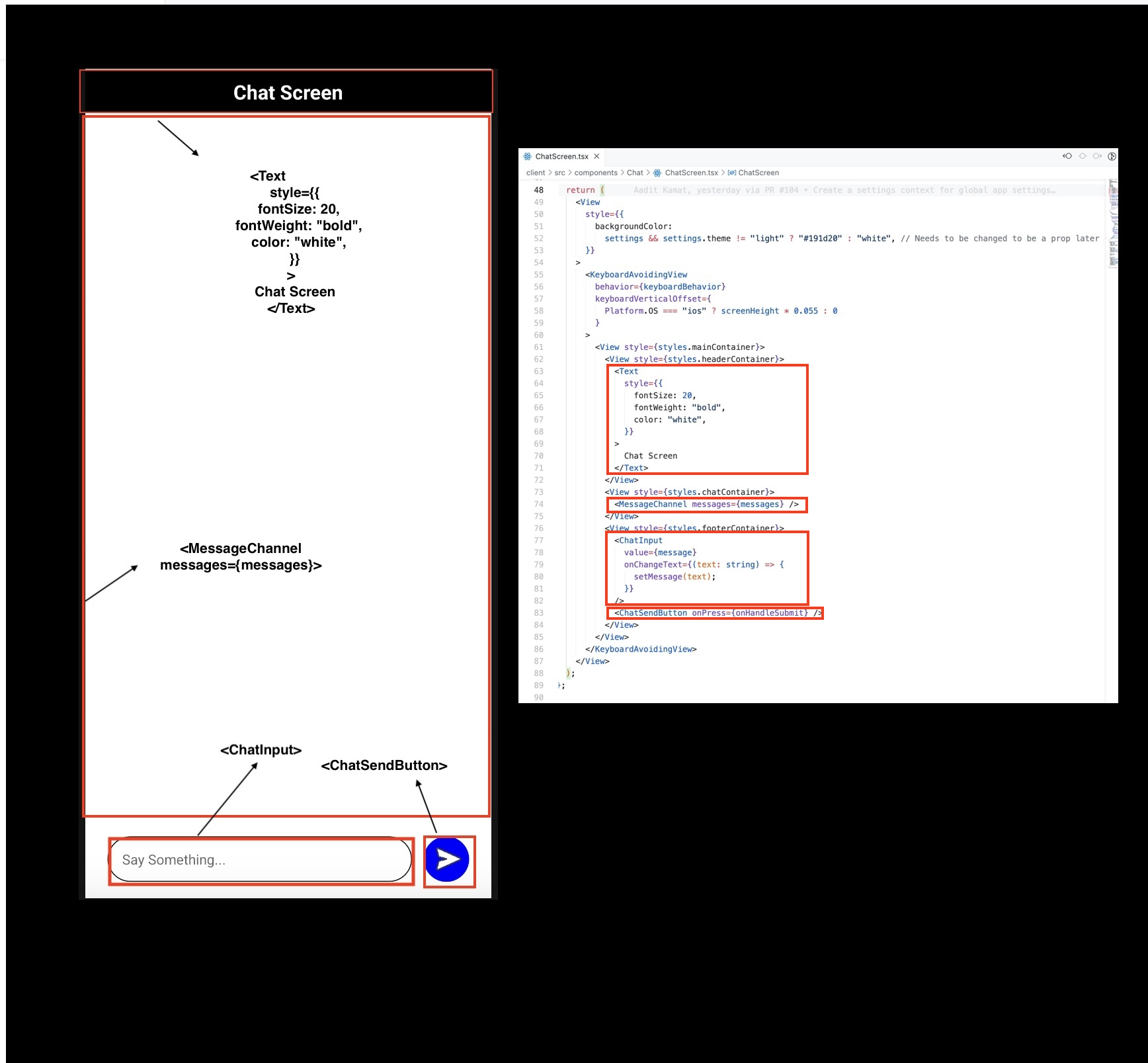
Here's a visual example of how the chat screen (described by the ChatScreen component) has been created from a combination of React Native Core Components and custom built components. This component is used within the (home)/chatchannel.tsx file that describes the page as a whole.

Code example
Let us take the example of the LoginScreen.tsx component that resides in the Auth subdirectory. This is used as one of the main components for the Login page described by (auth)/login.tsx.
The reason why it has been extracted into own component is because we will likely include a Login component in other mobile app pages as well.
The underlying design principle is simple: we extract components so that they can be reused in different pages rather than creating them from scratch each time we want to add a new page.
typescript
import {
  View,
  Text,
  StyleSheet,
  Dimensions,
  KeyboardAvoidingView,
  Platform,
  TouchableWithoutFeedback,
  Keyboard,
} from "react-native";
import { LogInEmailInput, LogInPasswordInput } from "../Common/CustomInputs";
import LogInButton from "../Common/LogInButton";
...
return (
<TouchableWithoutFeedback onPress={Keyboard.dismiss}>
    <KeyboardAvoidingView
    behavior={Platform.OS === "ios" ? "padding" : undefined}
    >
    <View style={styles.main_container}>
        <View style={styles.header_container}>
        <Text style={styles.header_text}>Welcome back!</Text>
        </View>
        <View style={styles.input_container}>
        <LogInEmailInput
            value={email}
            onChangeText={(text) => setEmail(text)}
        />
        <LogInPasswordInput
            value={password}
            onChangeText={(text) => setPassword(text)}
        />
        </View>
        <View style={styles.button_container}>
        <LogInButton onPress={onHandleSubmit} />
        </View>
    </View>
    </KeyboardAvoidingView>
 </TouchableWithoutFeedback>
);
import {
View,
Text,
StyleSheet,
Dimensions,
KeyboardAvoidingView,
Platform,
TouchableWithoutFeedback,
Keyboard,
} from "react-native";
import { LogInEmailInput, LogInPasswordInput } from "../Common/CustomInputs";
import LogInButton from "../Common/LogInButton";
...
return (
<TouchableWithoutFeedback onPress={Keyboard.dismiss}>
<KeyboardAvoidingView
behavior={Platform.OS === "ios" ? "padding" : undefined}
>
<View style={styles.main_container}>
<View style={styles.header_container}>
<Text style={styles.header_text}>Welcome back!</Text>
</View>
<View style={styles.input_container}>
<LogInEmailInput
value={email}
onChangeText={(text) => setEmail(text)}
/>
<LogInPasswordInput
value={password}
onChangeText={(text) => setPassword(text)}
/>
</View>
<View style={styles.button_container}>
<LogInButton onPress={onHandleSubmit} />
</View>
</View>
</KeyboardAvoidingView>
</TouchableWithoutFeedback>
);The following code snippet represents how the Login Screen will be rendered once a page in the mobile application invokes this component.
The TouchableWithoutFeedback, KeyboardAvoidingView, View and Text sub-components used within Login Screen come from React Native, as you can see from the first import.
Others like LogInEmailInput, LoginPasswordInput and LogInPasswordInput are custom designed components that reside within the Common subdirectory of the src/component directory.
These have been built from React Native core components the same way LogInScreen has.
React Native Props
The properties passed to these components, referred to as Props, can be found in the React Native docs as well.
The style props is a common one that is added to most components where you want to add styling using the React Native StyleSheet object.
More details about styling can be found in the styling guide.
The other props used are behavior in the KeyboardAvoidingView component, value and onChangeText in LogInEmailInput and LogInPasswordInput and onPress in LogInButton.